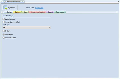
The Chart tab of the Report Definition screen allows you to
define and configure the appearance of your report data in charts. The Chart
Option tab is where you will select the chart settings, options and displays for
generating sophisticated graphical report views.

The available action and items on the Chart tab include:
•Allow Chart view – This checkbox option allows report data to be viewed as a chart. When selected, the default Chart Type of “Pie” will be assigned.
•View as Chart by default – This checkbox option indicates that report data should always be viewed as a chart.
•Chart Type – Select the chart type that will be used to display your data. Options include:
o Pie
o Doughnut
o Torus
o Column
o Stacked Column
o Bar
o Stacked Bar
o Line
•3D Chart – This checkbox option indicates that report data is to be rendered as a 3-dimensional chart.
•Show Legend – This checkbox option indicates that the chart should include a legend.
•Show Data Labels – This checkbox option indicates that the chart should include a data label. Data labels will reflect the data formatting, such as percentages, commas, etc.
Note: If you have established a drill down order in your Report Definition’s Options tab in the Segment grid, you will have the capability to drill down on your Report Definition’s Charts in the same manner as standard formatted line and column reports. The drill down data will be rendered in the same chart format as that which was specified in the Chart Type drop-down field.